Madame Tussauds vending shrouds
The brand
Coca-Cola, Madame Tussauds
The brief
To theme and brand three separate areas within Madame Tussauds’ queuing system and integrate vendor machines, making each area more impactful, stimulating and interactive.
The solution
This was an exciting project for us and we loved every minute. Because of the nature of Madame Tussauds, there was a big emphasis on authenticity and realism, so making sure Coca-Cola’s brand didn’t look out of place was paramount. We also enjoyed the challenge of making two very strong identities – Madame Tussauds and Coca-Cola – coexist effortlessly together.
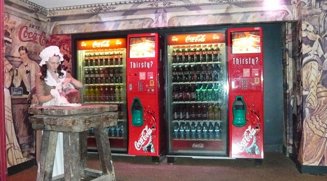
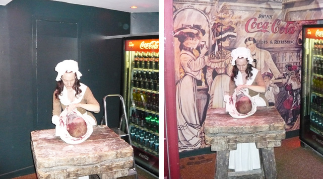
French street scene
To incorporate Coca-Cola’s brand into the look and feel of the scene, we sourced authentic brand imagery from Coca-Cola’s archives and adapted it to fit the bill. We then reproduced the graphics onto digitally printed wallpaper and header panel. The result did Madame Tussauds proud.
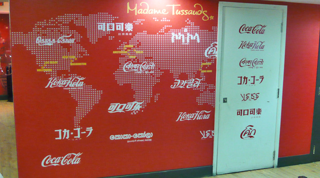
Global brand identity
People come from far and wide to visit Madame Tussauds, so we wanted to create an impactful wall graphic that would appeal to an international audience. We did this by showcasing the global nature of Coca-Cola’s brand and managed to subtly integrate it with Madame Tussauds’ identity.
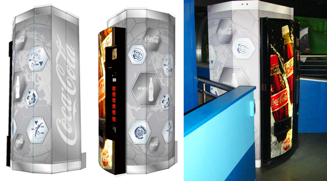
Jointly branded and themed vendor
When a vendor can be seen from all sides, it needs to be adapted to look good at every angle. So we created a Coca-Cola branded ‘pod’ encasement, theming it to sit fluidly in the vicinity.


